-default.png)
This guide will walk you through the process of customizing your upsell widget size for both desktop and mobile devices in AppSell.
Overview
AppSell allows you to customize the size of your upsell widgets to ensure they fit perfectly with your store's design and provide the best user experience across all devices. You can adjust sizes separately for desktop and mobile views to optimize conversion rates on each platform.
Step-by-Step Instructions
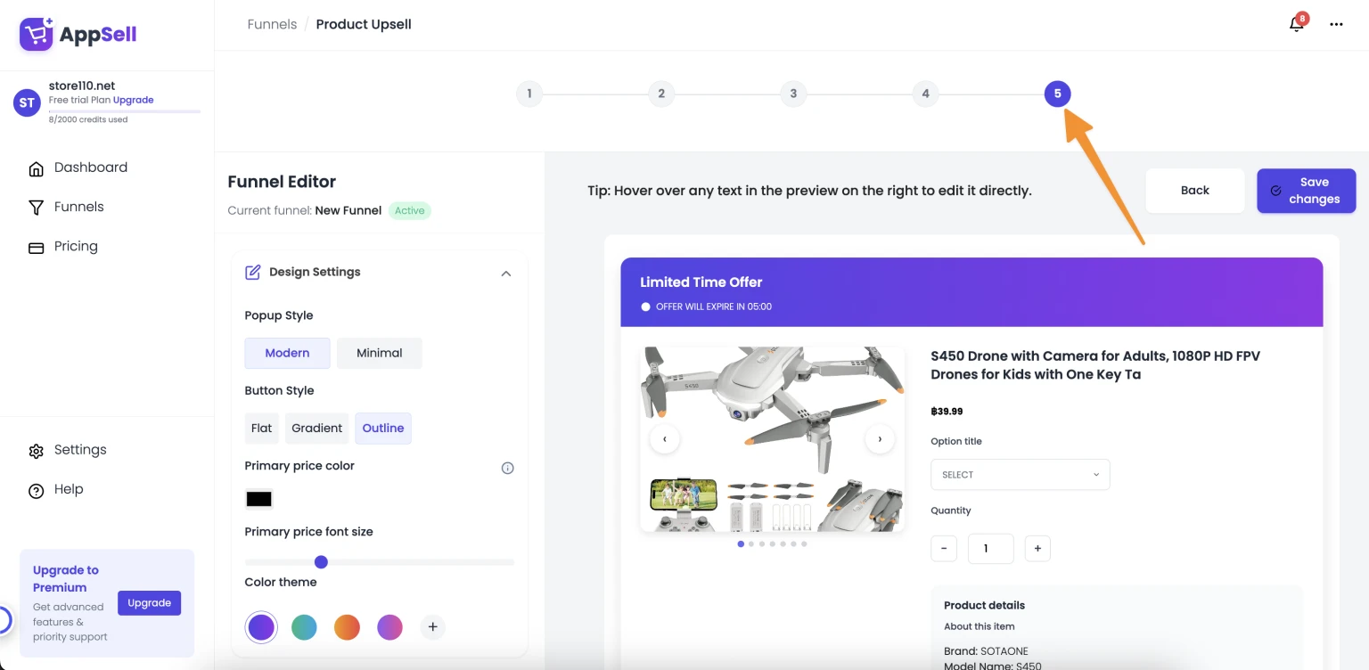
1. Navigate to the Preview Step
When creating a new upsell/cross-sell funnel or editing an existing one, complete your funnel setup and navigate to the Preview step - this is the final step in your funnel configuration process.
2. Access Widget Customization Options
Once you're in the Preview step:
Look for the "Features & display" tab located on the left side of your screen
Click to expand this section to reveal all customization options
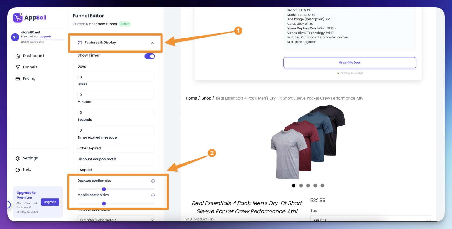
3. Adjust Widget Sizes
Within the "Features & display" section, you'll find two important sliders:
Desktop Section Size
Use the "Desktop section size" slider to adjust how your widget appears on desktop devices
Move the slider left to decrease the widget size
Move the slider right to increase the widget size
Mobile Section Size
Use the "Mobile section size" slider to optimize your widget for mobile devices
Adjust independently from desktop settings for the best mobile experience
Consider that mobile screens have limited space, so smaller sizes often work better
4. Preview Your Changes
Important Note: The changes you make using these sliders will be reflected directly on your live store, not in the dashboard preview.
This means:
Your actual customers will see the size changes immediately
The preview in your dashboard may not accurately represent the final appearance
We recommend testing the changes on your store to ensure they look as expected
Best Practices
Desktop Sizing Tips
Larger widgets can be more eye-catching but shouldn't overwhelm the page
Consider your store's overall design and spacing
Test different sizes to find what converts best for your audience
Mobile Sizing Tips
Mobile users have less screen space, so smaller widgets often perform better
Ensure the widget doesn't interfere with the mobile shopping experience
Make sure text and buttons remain easily clickable on mobile devices
Testing Recommendations
After making changes, visit your store on both desktop and mobile devices
Check how the widget appears in different product pages
Monitor conversion rates after size changes to optimize performance
Troubleshooting
If you're experiencing issues with widget sizing:
Changes not appearing: Remember that changes reflect on your live store, not the dashboard preview
Widget too large/small: Use the sliders to fine-tune the size incrementally
Mobile display issues: Adjust the mobile section size separately from desktop
Performance concerns: Monitor your store's loading speed after size changes
Need Additional Help?
If you need further assistance with widget customization or have questions about optimizing your upsell funnels, please don't hesitate to contact our support team:
This guide covers the basic widget sizing features. For advanced customization options or integration questions, please refer to our developer documentation or contact support.